Biocoded mobile app: Boost conversion rate
Company: Biokoda
My role: Sole UX/UI Designer
Date: 2015 - 2019
Mobile phones have become an essential part of our lives and messaging is one of the most common methods of communication. This case study documents the process of redesigning the the Biocoded app, a software development company Biokoda based in Ljubljana, Slovenia.
Biocoded is a messaging and calling app that allows users to send and receive messages, calls and a variety of media, such as photos, videos, documents, voice mails and location. All messages and calls are secured with end-to-end encryption, meaning that no third party can read or listen to them.
Problem:
Redesign the mobile application for both iOS and Android and increase the conversation rate. The importance of sending messages and making phone calls is the core to the brief for creating a simple owing mobile app, with the following points in mind:
Create an easy-to-use application with the priority of messaging and contacts
The interface has to be simple and has to solve the UX problems.
My role:
Full time employed for 4 years to improve the user experience on Biocoded app
Collaborating with the stakeholders, product lead and development team
Created design sprints and Jira tickets to prioritise features
Created wireframes, process flow, UI components and prototypes
Designed responsive, unique and clean mobile application for iOS and Android
Discovery phase
Most of my design process was brainstorming ideas to minimise repetitive work and maximise my time for creativity. I divided my design process into 5 phases following the IDEO’s human-centred design thinking process.

Understanding the problem
General user feedback indicated that users found that the app flow was unintuitive. The most issues were related to managing Biocoded chat records and contact information without compromising sensitive and private information. Empathising with user’s needs was a critical part before starting this project. I wanted to understand their concerns and frustrations in regards to using the app and find out what would help in making that process more accessible for them.
To start with the design infrastructure, the product lead and I had to create a plan for how to implement the new design. Changes had to occur across both platforms Android & iOS at the same time, that’s why in our design sprint we involved the devs as well. We looked into our competitors, we gathered general user feedback and scheduled a lot of sessions to find the answers like: What’s the pain purpose here? Where do we want to be in six months? etc.
Once I had the essential insights I was ready to persuade with more in-depth research to validate our assumptions.
Survey
Surveys are a relatively easy way to get specific information from our users. To get effective information I try to keep the questions short and focused, containing a mix of closed and open-ended questions.
In order to identify potential pain points, I sent the survey to our active users. Experienced active users are more likely to encounter issues with the user interface and user experience design due to their frequent use of the mobile application.
25 users participated In the survey, 14 of them being iOS users and 11 Android users. Some of the quantitative data based on the survey is shown below:

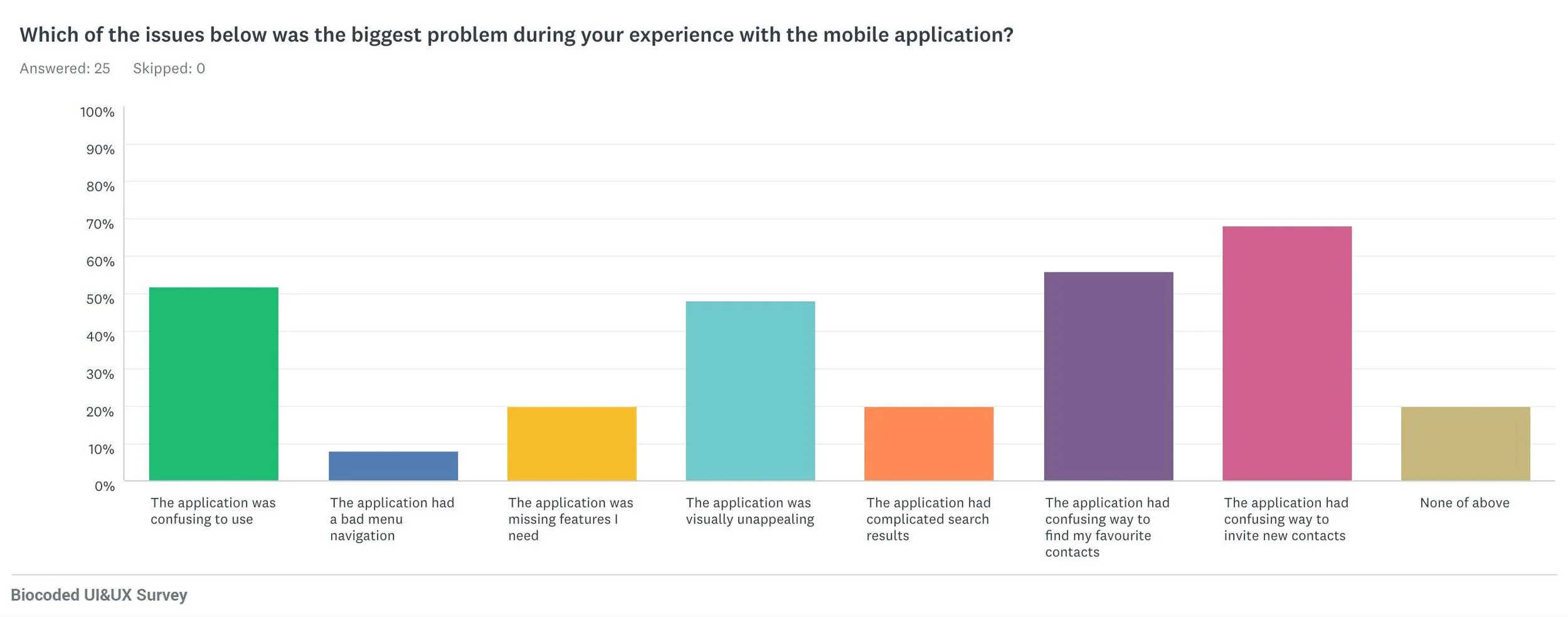
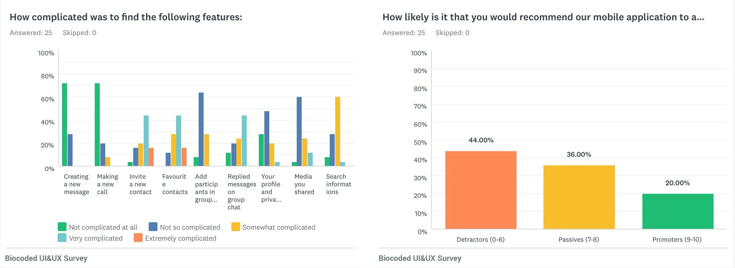
78% of users encountered issues with finding their favourite contacts (iOS).
27% of users encountered issues with finding their favourite contacts (Android).
78% of users encountered issues with inviting a new contact on the platform (iOS).
55% of users encountered issues with inviting a new contact on the platform (Android).50% of users encountered issues with finding the right replies in group chat (iOS).
36% of users encountered issues with finding the right replies in group chat (Android).50% of users found our application visually unappealing (iOS).
45% of users found our application visually unappealing (Android).62% of users found our application outdated (iOS).
36% of users found our application outdated (Android).

Job Stories
After identifying the main issues with the help of our survey participants, I set out job stories:
When I’m out of my town , I want to be able to easily contact my friends and family , so that I can stay in touch with them.
When I use group chat messaging , I want to be able to indicate which question I’m answering , so that I will avoid misunderstandings.
When I’m in a rush and concerned about my privacy , I want to be able to easily find my last conversation with my favourite friends , so that I can easily call or message them.
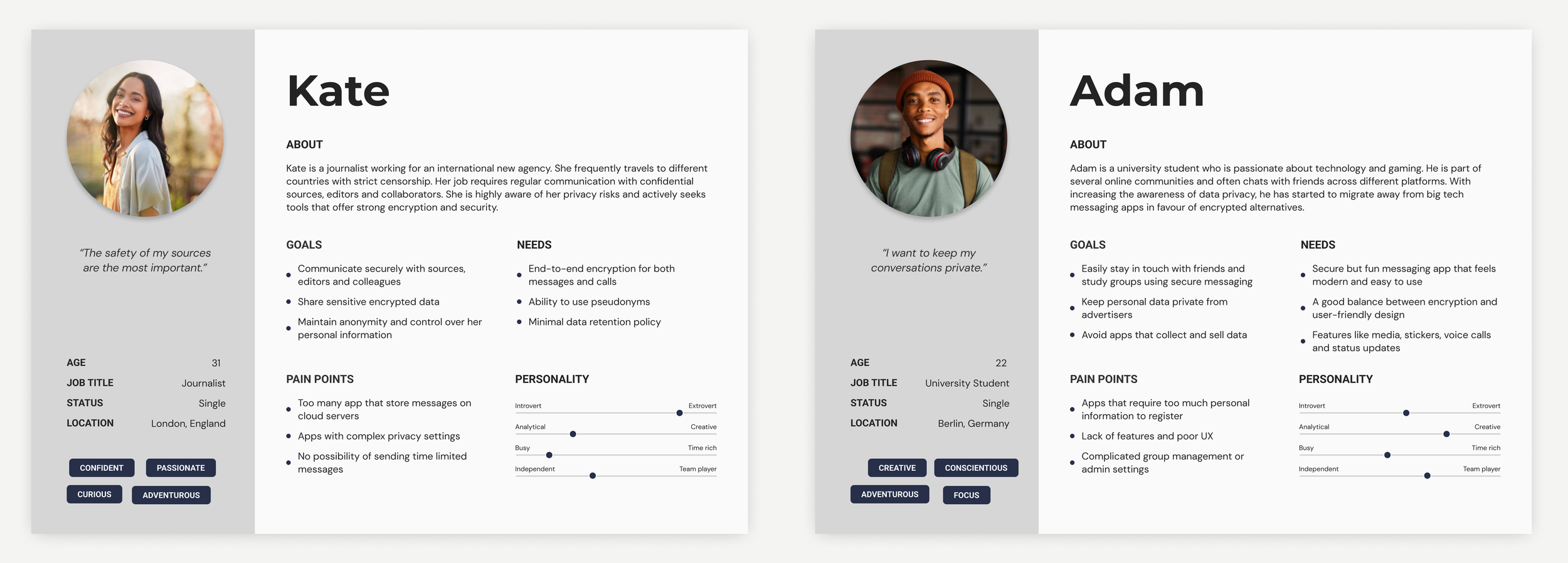
Personas
Based on the information I gathered, I used the personas method to better understand my users. The survey also help me to build these personas and try to better understand our users needs, experiences, behaviours and goals.
Affinity Mapping
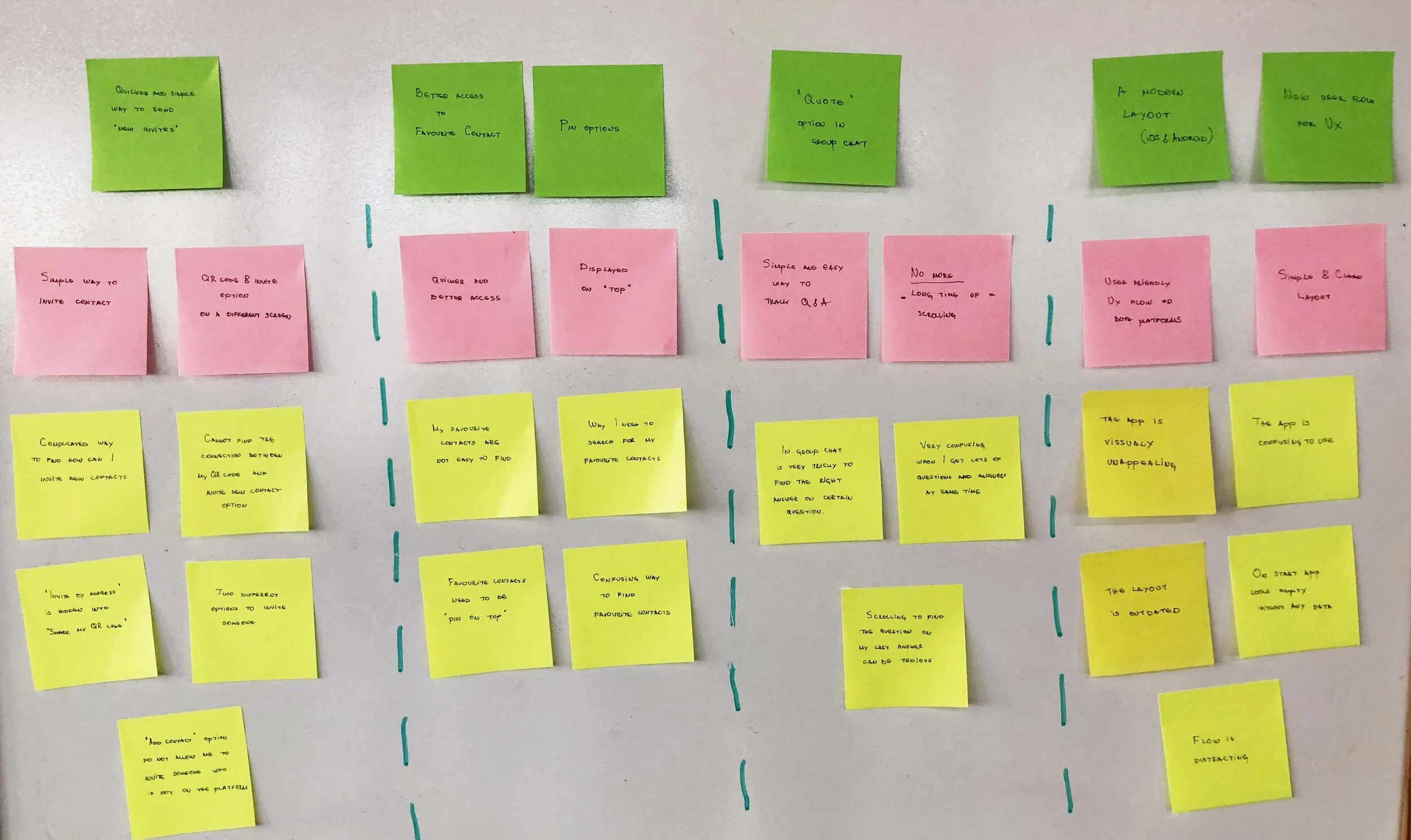
I compiled the information I gathered from our surveys, job stories and personas into affinity mapping to group related observations. The first step was to take all the data collected and write them down on yellow sticky notes (each sticky note had just one critical piece of information). Red notes represent a clear idea from all the information received from yellow notes. Green notes represent the solution to help solve our user needs.
Doing this analysis helped me to sort through all the user’s needs to get a clear view of what is important while satisfying business goals.
Solutions & UI sketching
Now that I’d identified pain points, I tried to find the best solutions to them and introduce new features to improve the user interface and experience on our mobile application.
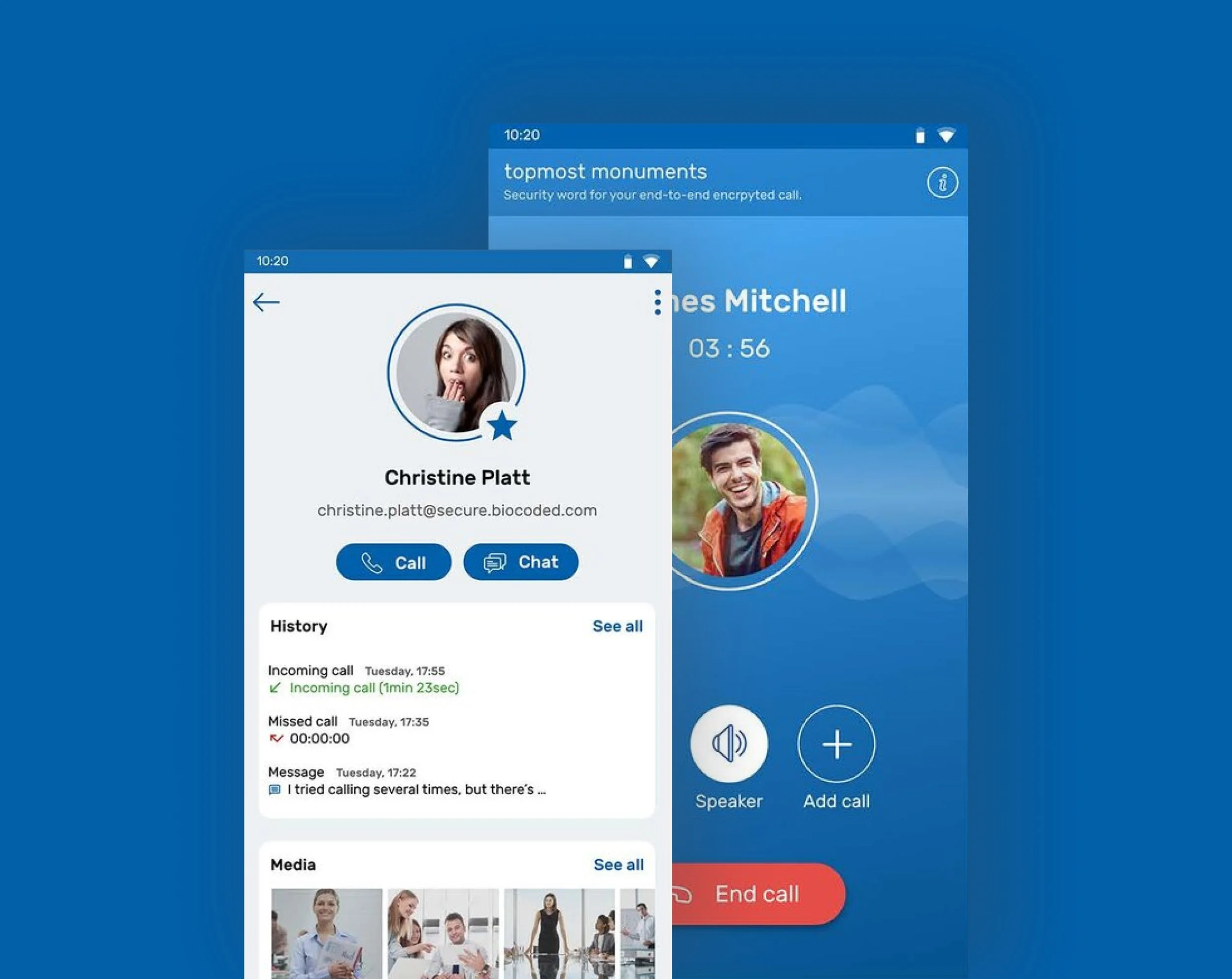
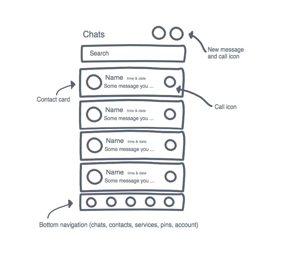
Overall, I completely redesigned the current main screen, trying to give better access to favourite contacts, chats, recent calls and messages. I’ve improved and made the main screen more user-centred and merged messages and calls in one “contact” card.


I designed the ‘invite contact’ and ‘add contact’ options to be on a single screen. The actions are now available in the bottom navigation tab “Contacts”, where you can easily add a new contact or invite a new contact who is not using the Biocoded application yet.
In order to have a familiar chat concept for the users, I created a flow where users can quote any question in the conversation and type a reply. This will help users to more easily track the right answers on the questions they are replying to. Shown bellow are some of the UI sketches I drew to improve our user interface and user experience.

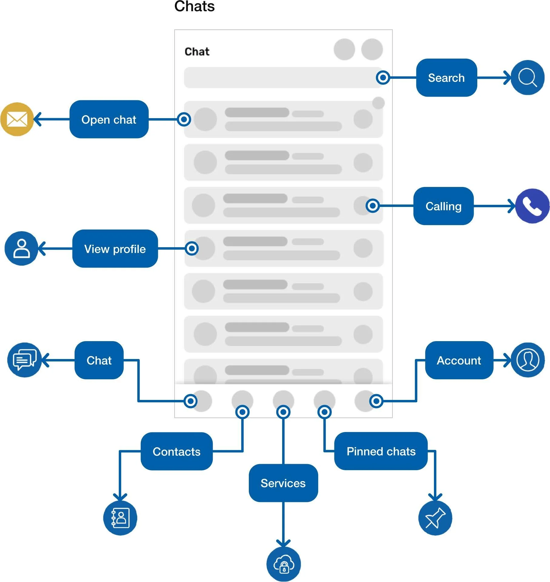
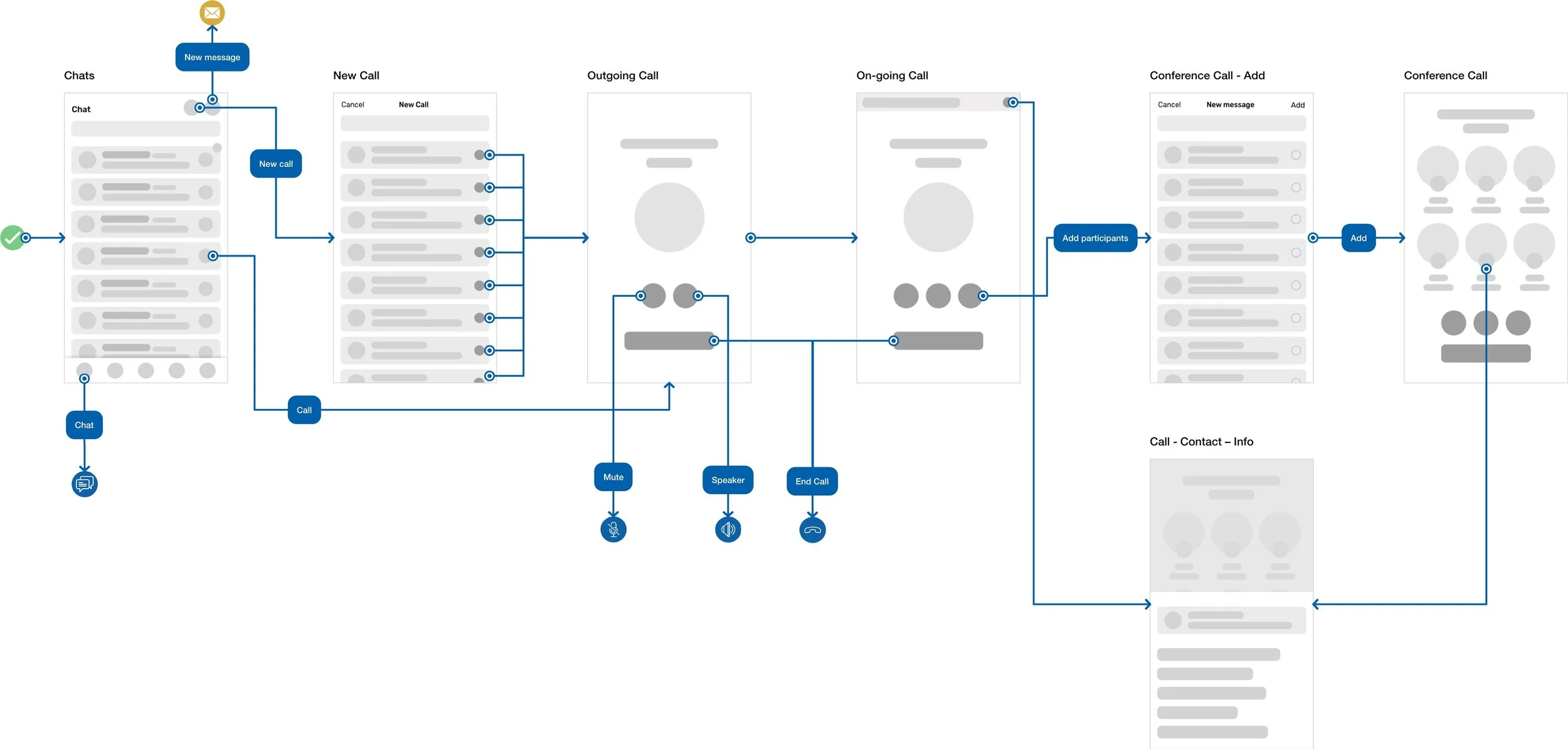
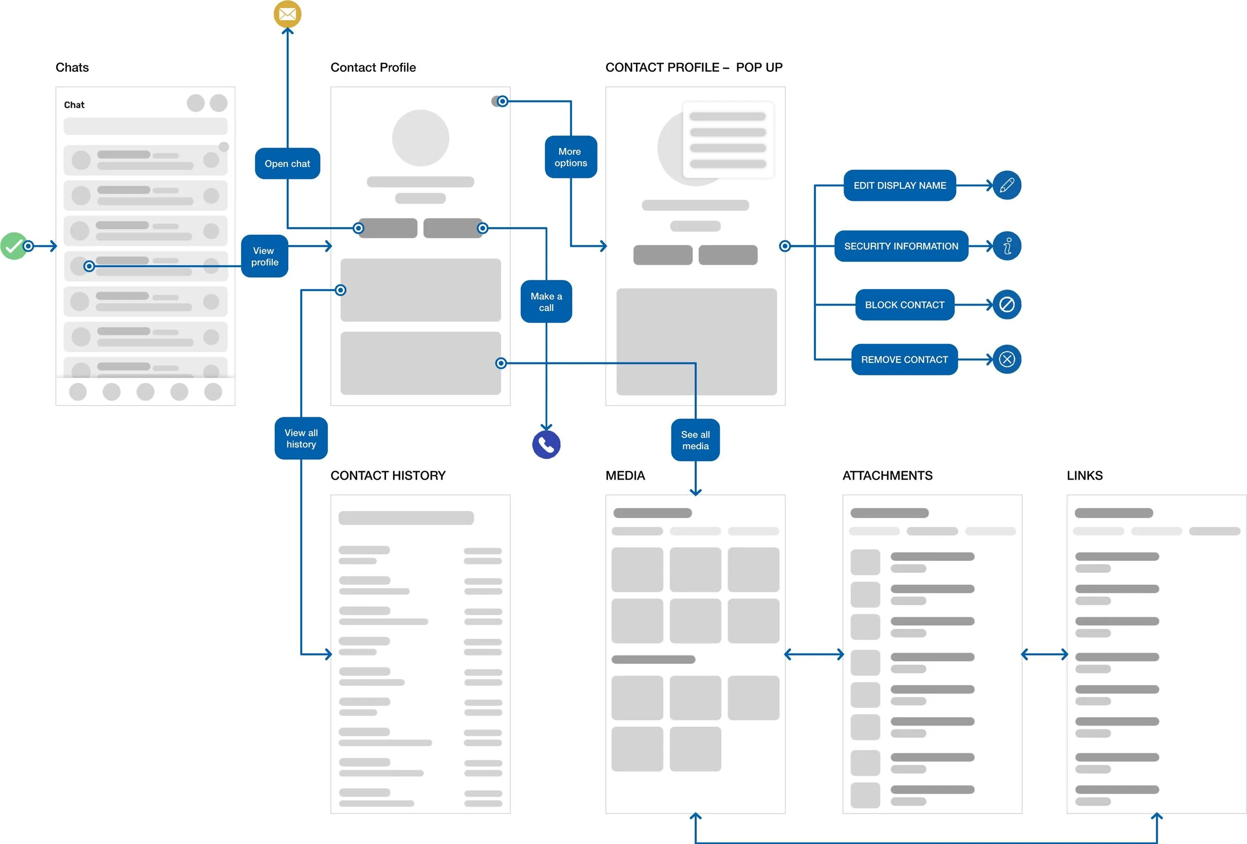
User Flow
Since I had an idea of what users needed, I could begin creating user flow. Working through the user flow helped me to map out the paths a user would take and also helped me to make sure I ended up making appropriate wireframes.
(Use the arrows to see more examples.)


Design
With the prioritised features in place, I proceeded with the high-fidelity wireframe for our new mobile application re-design concept.
Next steps & Takeaways
Working on this project gave me a lot of valuable experience. It shows that UI/UX designers should always consider users needs and goals that are vital in creating the successful experience. Collect as much quantitative user data as you can, then analyse and categorise them to support the re-design. Follow the design process, release, get user feedback and iterate. Get to know your real users - user testing is the key!
What can I do better?
Select participants from different areas to do research on user behaviour.
Usability test the prototype with users.
Have conversations with users and guide them through the difficult times of errors and uncertainty to achieve a better form of validation.Next steps & Takeaways
Working on this project gave me a lot of valuable experience. It shows that UI/UX designers should always consider users needs and goals that are vital in creating the successful experience. Collect as much quantitative user data as you can, then analyse and categorise them to support the re-design. Follow the design process, release, get user feedback and iterate. Get to know your real users - user testing is the key!
What can I do better?
Select participants from different areas to do research on user behaviour.
Usability test the prototype with users.
Have conversations with users and guide them through the difficult times of errors and uncertainty to achieve a better form of validation.

Biocoded webpage
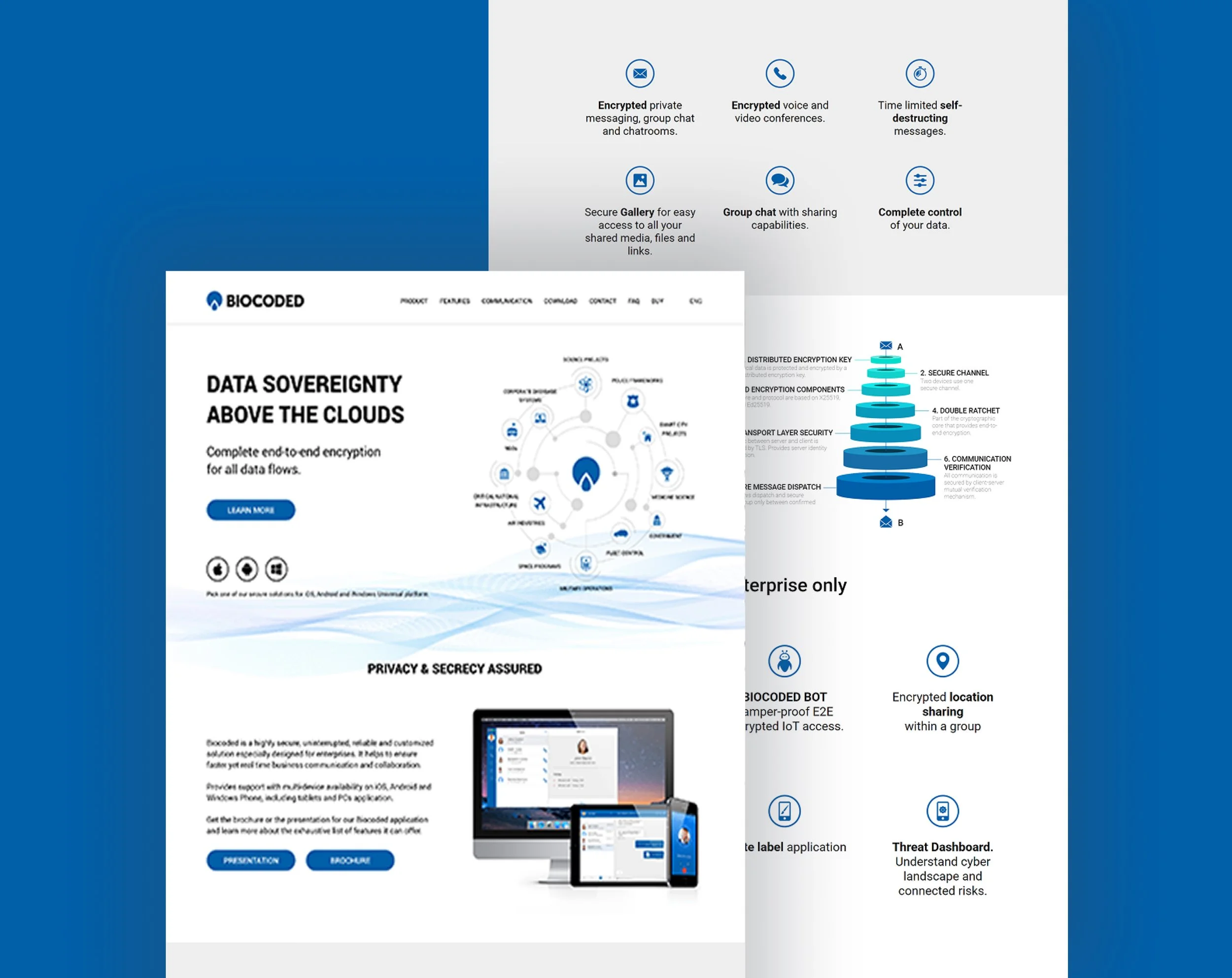
Additionally, I was working on redesigning the Biocoded webpage as well. The main focus on the webpage is the Biocoded product, which is an end-to-end encrypted voice call and messaging app. It is available as a free cloud service for end users and as a licensed self-hosted server installation for complete in-house privacy.
Understand the problem
After I analysed the current Biocoded webpage, I concluded that it needed a redesign for the following reasons:
the webpage looked outdated.
the values of the product were not clearly visible on the webpage.
it felt more like an informative website, without a proper CTA.
it was hard to see and understand all the features the product provides.
User Interview
Before I started creating my user personas, I did a little research about the users and their needs. The main data I had was coming from the interviews with the current users that were already using the Biocoded application. I interviewed 8 people who had difficulties understanding the purpose and the features of the product.
Below are the sample questions asked in the user interviews:
Do you understand the difference between the Biocoded Global and Private product?
What’s the purpose of the Biocoded product?
Can you easily find the download button for the right platform?
Due to sensitivity of data I’m unable to share all the user interview questions and findings.
Identifying Users
To better understand the users, I categorised them in two sections and identified their characteristics and needs from the webpage:
Individuals:
people that want to communicate with friends and family.
they want to find out the features of the product.
they want to easily download the application for their own devices.
Business companies:
large or small business/companies that need their own secure communication solution.
need more specific information about the product to understand if it meets their needs.
want to find out more about the cost of the professional solution.
Design
Once I had all the information, the next step was to illustrated the necessary graphic. The main purpose was to help users understand the features that the main product provides. I stated with the illustrations and the concept for the company webpage, and once the team agree on the concept, it was time to start designing the hi-fi webpage.


Hi-fi Wireframe
TI created a high-fidelity interactive prototypes in Adobe XD. Due to the sensitivity of the data I’m unable to share the clear view of the final webpage design and all the illustration included in the final design.
