Yell webpage: Uncovering value and driving improvement
Company: Yell
My role: Senior UX/UI Designer
Date: 2019 - 2021
Yell is a UK leading marketing and online business directory with over 2.9 million listed business based in Reading, England. Helps small businesses across UK be successful through free and sponsored business listing on Yell webpage, and also helps consumers in their search for trusted local suppliers.
Problem:
Content is unique to Yell and cannot be mimicked by Google on it’s own search page via Google my business. Yell’s SEO lead believes that valuable opportunities are being missed with the current simple format that the content is delivered with.
The initial offering from Yell to customers is to set up a business listing online and provide as much content as possible about it. The way we can create value for our customers is by encouraging them to give good descriptions, good photos, providing a great user experience and helping them by presenting their reviews as best we can. Currently an SEO exercise is taking place to ensure content parity between the mobile and desktop versions of Yell.com.
My role:
Full time employed for 1.8 year to improve the overall user experience
Part of the small UX team of three people
Planed unmoderated and moderated usability tests, surveys and user interviews
Created wireframes, process flow, UI components and prototypes
Designed responsive and clean web and mobile experience, and other Yell products

Research: Improving the Review Summary
Understanding the problem
During the planning and research session, we identified a possible opportunity to improve the value of the ‘review summary‘ by adding additional filtering and sorting features. To address this Yell’s SEO and UX team proposed additional features for upcoming testing:
Integrating a review summary box, highlighting top attributes
Adding ability to filter reviews by clicking on attribute tags
Adding ability to sort reviews
Assumptions have been mapped out below which we intend to explore and gain more insight around to validate if the review summary will gain additional value with the ability to filter and sort reviews to the business listing:
The purpose of this test is to establish if a ‘reviews summary’, with sorting and filtering features provides value to the business listing for a user. As with all research it’s essential to define and establish the users and business goals. From meetings with the stakeholders and planning design sprints including the dev team as well, we were able to gain valuable insights through our Adobe Analytics and Mouseflow tools. Based on this data, we were able to map out our assumptions and considerations.

Assumptions:
YES.
As a customer, I want to have a review summary that doesn’t misinterpret how a product/service has been rated.
As a customer, I rely heavily on the review summary to provide the overall picture of how other users experienced the product/service
As a customer, I understand the meaning behind those summaries and filters
As a customer, I want to see the ‘reviews summary’ and ‘filters’ for the business at first glance
As a customer, I want to filter the given reviews based on specific criteria
As a customer, I can easily navigate through the review summary and learn more about the value of the products/services
As a customer, I want to rate the reviews from the other customers as ‘Helpful’
NO.
As a customer, I don’t need a review distribution summary as I can judge the product/service by the given reviews
As a customer, I don’t rely heavily on the review distribution summary
As a customer, I don’t know what the ‘reviews summary’ box and ‘filters’ mean
As a customer, I don’t want to filter the given reviews on specific criteria
As a customer, I have difficulties finding the real value of the products/services based on the review distribution summary
As a customer, I don’t want to rate the reviews from the other customers
Considerations:
Building the reviews tag will require significant backend build, therefore knowing its value beforehand is critical
A PGS’ AI team is likely to be involved therefore third party cost needs planning, and this research will help determine potential return
Personas
Based on the information I gathered, I used the personas method to better understand my users. Before I created the personas I was able to learn more about our users through previous user interviews and recorded calls, so I could better understand our users needs, experiences, behaviours and goals. Due to sensitivity of the data I’m unable to show our findings and our validated user personas, however, I am able to share below some user personas I created before the validation phase.


Usability test
Method
We will create a mockup of several BIP (business profile page) pages which are very similar and expose a panel of users to them in Usability Hub. The panel demographics will be quite general as is the audience of Yell.com:
Users aged 20-65
Male and female
UK based
Mobile based
Employment status employed, self employed and retired
The test starts with an instruction screen and a short description. After that a mobile screen with a design screenshot is presented which includes a free text field, asking the user - ‘Which 3 bits of information on this profile page are most likely to influence your decision in selecting a product or service from the business’. After this several follow up questions will be asked to gain more insights about what a user was thinking or feeling about the experience.
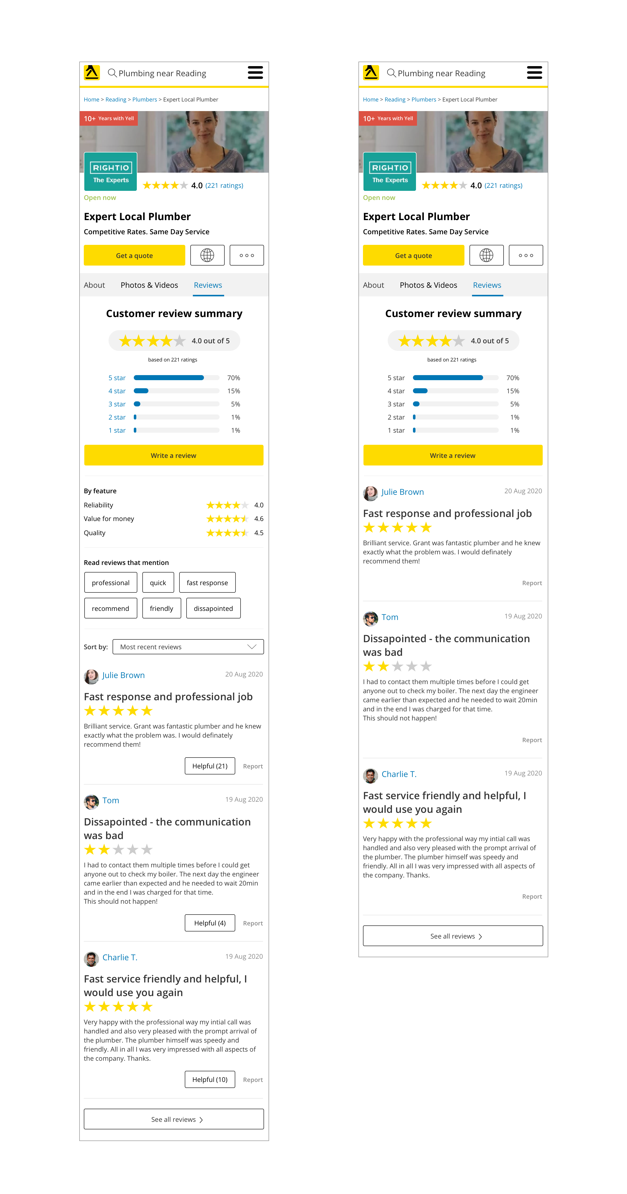
Due to the sensitivity of the data I’m unable to share all the custom questions and actions that were required to be performed or answered by the users, but here is an example for one of the screenshots that was used in the test.

Task & Metrics
To get a better understanding of the problem we are facing, we define the following tasks, metrics:
Task
Presenting screen with questions
Selecting a screen
Follow up questions
Metrics
The number of users who select the card displaying ‘reviews summary’ and ‘filter’ vs those who don’t
Which 3 bits of information is specified by users as most valuable
Number of users who understand correctly what ‘review summary’ and ‘filter’ icons are intended to mean
The number of users using ‘Sort by:’ functionality and finding it valuable
The number of users who said the ‘Helpful’ button would impact their decision on choosing the business
Hypothesis
H1: Majority of users select a listing with ‘reviews summary’ with ‘filters’ and ‘sorting’ features over those without additional features - users understand and perceive them to add value.
H2: Majority of users do not select a listing with ‘reviews summary’ with ‘filters’ and ‘sorting’ features - users don’t perceive noticeable value in them.
H3: Majority of users select a listing with ‘reviews summary’ with ‘filters’ and ‘sorting’ features over those without, but fail to offer correct explanations of what they mean - the ‘review summary’ and ‘filters’ add little perceived value, but the additional facets aid perceived quality somehow.
H4: Majority of users find the ‘Helpful’ button as a positive impact on their decision on choosing the business.
User findings
The unmoderated usability test was run through 30 users and the main purpose was to identify the value of the ‘review summary’ including filtering and sorting features.


Before we write down the findings, we write all the user feedback and quotes on notes and sort them by topics (Affinity Diagramming) using the InVision Freehand. Once the notes are organised, we study them and turn them into findings with determined severity.
For easy reference, the findings in the report are identified as High, Med(ium), Low, or Good and appear as follows:
GOOD: The designs were simple and users understood it
HIGH: Users could not complete the task or experienced significant frustration
MED: Users had some difficulties completing the task, but could complete it
LOW: Users experienced minor frustration or issues when completing the task
Recommendations are written in Blue. One recommendation may address several usability issues
Example of finding
GOOD: Users do find the additional review information features useful.

Users like the new proposed design screen with the new review information and they do find them useful. Some of the users feedback:
“Yes, it’s broken down into key parts and is clear and easy to understand” - 27 years old, male, UK
“Yes. Very much. It makes reviews more specific and targeted” - 47, male, UK
“Yes, it gives a nice summary without me having to read every review” - 33 female, UK
UX team recommendation:
Consider redesigning the profile page and adding additional review information, which would give the users the context they need to move forward.
Hypothesis result
To validate our hypothesis we defined the research as: ‘We will run the test with 30 users to get more information about the interest for reviews summary filters and sorting features, and ask follow-up questions to identify the user’s emotion associated with them. We will know the hypothesis is valid when more than 75% identify positive value using the features.
H1: Majority of users select a listing with ‘reviews summary’ with ‘filters’ and ‘sorting’ features over those without additional features - users understand and perceive them to add value.
Hypothesis H1 pass.
H4: Majority of users find the ‘Helpful’ button as a positive impact on their decision on choosing the business.
Hypothesis H4 failed
From here, we were able to get valuable insights to determined what to do next. Taking a moment to understand the questions and assumptions we had helped us to build a large database of insights about our users, which saved us time in spending months building a feature that users didn’t need.
Research: Identifying ‘Credentials’ Value
Understanding the problem
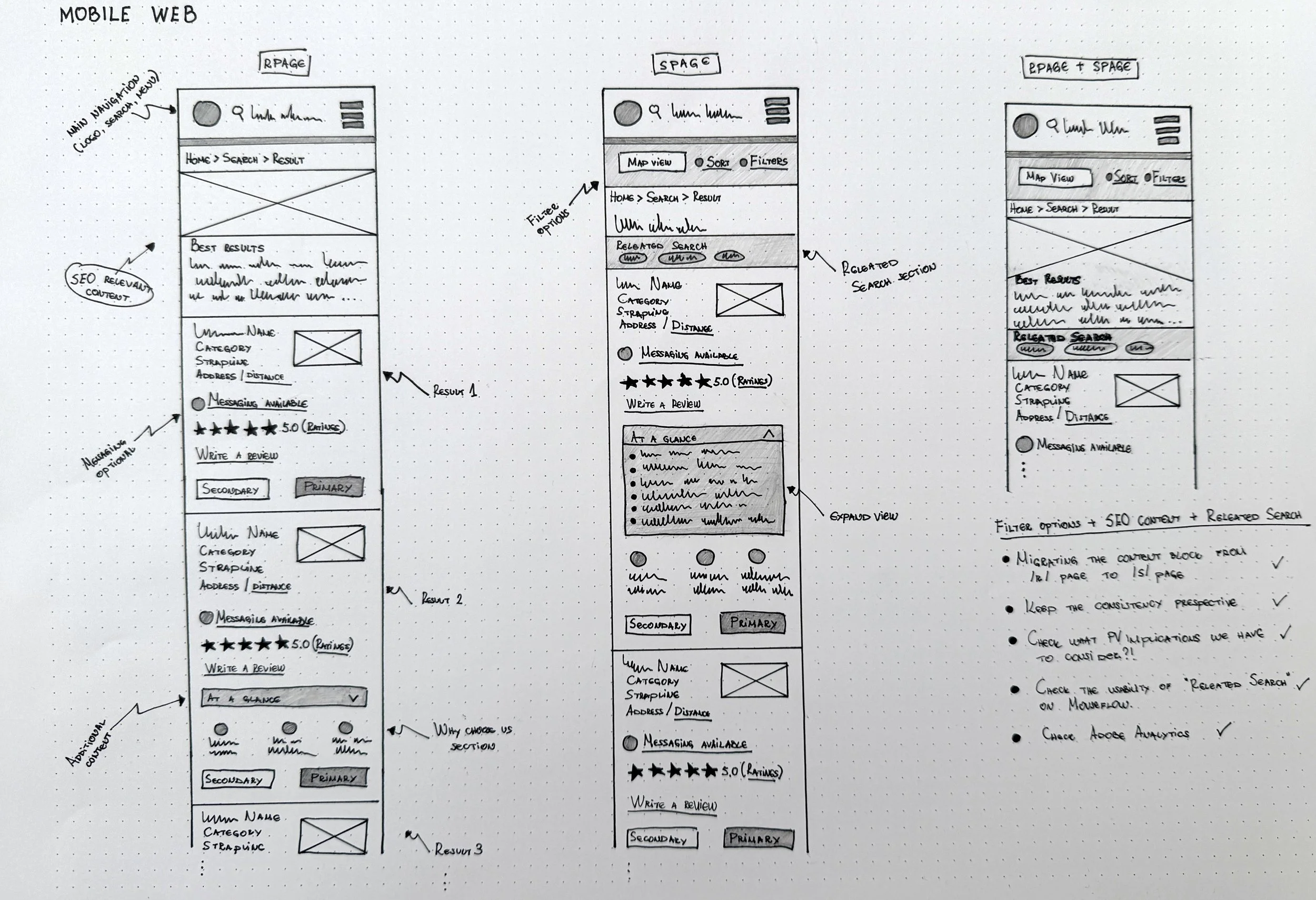
During the SEO parity exercise, a problem was identified around the value of ‘Credential’ icons, which are shown on the S-page (search page) for each business listings card. Currently, cards on the S-page display different content on desktop and mobile. This is a problem, particularly on mobile where there is limited space and therefore only the most informative and valuable content should be prioritised. One piece of content called into question is a feature called ‘Credentials’, which uses icons to convey a business’s facets such as associations, accreditations, qualifications and so on.
The ‘Credentials’ shown on S-page are represented with specific icons, whereas on the BIP page (business page) there is additional text to support the meaning of the specific icon. Currently there is no space for the credentials icons on the mobile S-page, so in order to gain parity to content on desktop they were removed from S-page for both platforms, which additionally gains SEO benefits.
Further conversations presented a legal challenge to this change. If the removal reduces the effectiveness of the business listing we’d be taking a risk. Therefore before making final recommendations, we are testing if the icons are understood or have any significant impact on the UX. If not they will stay removed from the S-page.
Each business card on the S-page desktop view can contain over ten elements, including for example; a profile picture, the credentials icons, name of the business etc. Being faced with all of this information, customers need to decide if they will choose the specific business or not. Assumptions have been mapped out below which we intend to explore and gain insight around to validate if ‘Credentials’ icons are recognisable enough and add value to the business listing card.
The purpose of this test is to establish if users are able to recognise the ‘Credentials’ icons on S-page business listing and to determine whether or not those icons provide value.
Based on the data, we were able to map out our assumptions and considerations.
Assumptions:
YES.
As a customer, I want to have a review summary so I don’t misinterpret how a product/service has been rated
As a customer, I can notice the icons easily
As a customer, I can understand the meaning behind those icons
As a customer, I want to see the ‘Credentials’ for the business at first glance
NO.
As a customer, I don’t know what those icons mean
As a customer, those icons don't represent anything to me
As a customer, I can barely see them amongst the rest of the information
Considerations:
Presenting the ‘Credentials’ icon on the business listing card is important for the merchants, as it represents extra value for their business
‘Credentials’ are an extra feature and merchants want to see what they are paying for
Presenting the ‘Credentials’ icon at first glance is important for the Sales Team to present and sell the feature
Personas
Based on the information I gathered, I used the personas method to better understand my users. Before I created the personas I was able to learn more about our users through previous user interviews and recorded calls, so I could better understand our users needs, experiences, behaviours and goals. Due to sensitivity of the data I’m unable to show our findings and our validated user personas.
Usability test
Method
We will create a mockup of several S-page cards which are very similar and expose a panel of users to them in Usability Hub. The panel demographics will be quite general as is the audience of Yell.com:
Users aged 20-60
Male and female
UK based
Desktop based
Employment status employed, self employed and retired
The test starts with an instruction screen and a short description. After that a desktop screen with a design screenshot is presented which includes a task to perform - ‘Look over the listings and click on the one you are most likely to select’ and a free text field into which they are asked to input - ‘What were the main reasons you selected that listing over the other two?’. After this, several follow up questions will be asked to gain more insights about what a user was thinking or feeling about the experience.
The test will be run twice to remove any bias based on the business card position during the task presentation.
Due to the sensitivity of the data I’m unable to share all the custom questions and actions that were required to be performed or answered by the users, but here is an example for one of the screenshots that was used in the test.

Task & Metrics
To get a better understanding of the problem we are facing, we define the following tasks, metrics:
Task
Selecting a card
Follow up questions
Metrics
The number of respondents who select the card displaying ‘Credentials’ vs those who don’t
Which 3-5 bits of information is specified by users and most valuable
Number of users who understand correctly what ‘Credentials’ icons are intended to mean
Hypothesis
H1: Majority of users select a listing with ‘Credentials’ icons over those without icons - users understand the icons and perceive them to add value.
H2: Majority of users select a listing without ‘Credentials’ icons over those with icons - users do not understand the icons or perceive them to have little value.
H3: Majority of users select a listing with ‘Credentials’ icons over those without icons, but fail to offer correct explanations of what they mean - the icons add little perceived value, but the additional facets aid perceived quality somehow.
User findings
The unmoderated usability test was run through 25 users and the main purpose was to identify the value of ‘Credentials’ icons and if those icons are factored in user’s decision making.

For easy reference, the findings in the report are identified as High, Med(ium), Low, or Good and appear as follows:
GOOD: The designs were simple and users understood it
HIGH: Users could not complete the task or experienced significant frustration
MED: Users had some difficulties completing the task, but could complete it
LOW: Users experienced minor frustration or issues when completing the task
Recommendations are written in Blue. One recommendation may address several usability issues.
Example of finding
HIGH: Users do not find the icons useful to them and the majority of them do not mentioned them as the main factor in their decision making.

Some of the users feedback:
“No, I'd not really know what they are or use them to make a final decision”- 35 years old, female, UK
“No. Unclear to me what they mean. If a key was provided, perhaps…” - 41, male, UK
“No, I don't know what they stand for” - 24 male, UK
UX team recommendation:
The vast majority of users did not find the credentials icons on the S-page a factor in their decision making or useful when they were directed to them specifically. The recommendation is the credential icons to be removed from the S-page on both web and mobile.